
🎨 The Psychology of Color in Your Workspace: Choose Hues That Boost Mood & Productivity
Share
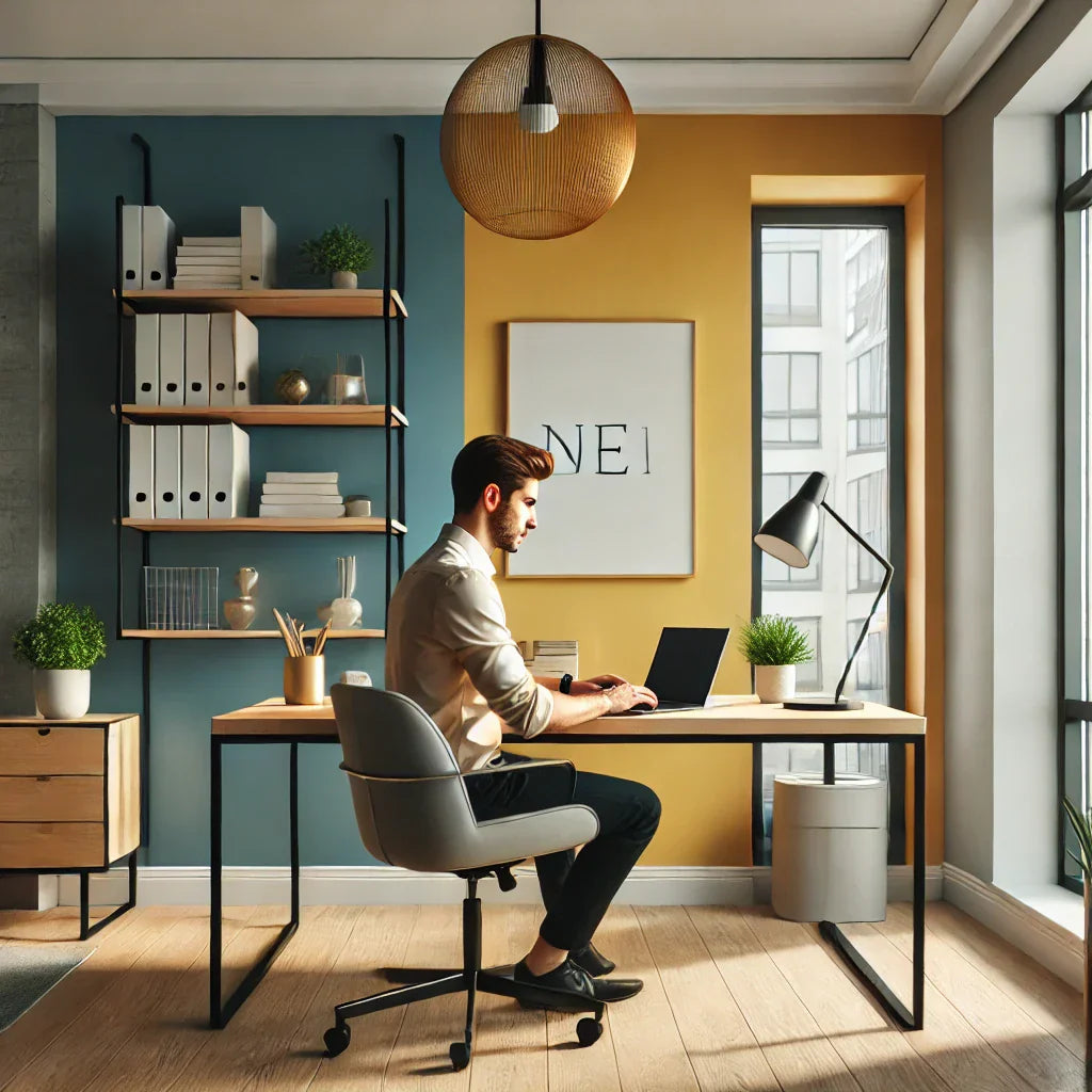
Ever wonder why some offices make you feel calm while others feel like a jolt of espresso? The secret may lie in the color on the walls—or even your sticky notes. Color psychology isn't just for artists or marketers; it plays a real role in how we work, think, and feel.
Let’s dive into the science of color and how you can use it to create a workspace that fuels your best self.
🔵 Blue: The Productivity Powerhouse
Blue tones are known to promote focus and mental clarity. That’s why many corporate offices and tech workspaces use blue as a dominant hue.
Use blue when:
- You need to focus for long periods (e.g., data analysis, writing).
- You want a calming atmosphere that reduces stress.
How to apply it:
- A blue desk mat or mouse pad
- Cool-toned desk organizers
- Blue-themed wall art
🟡 Yellow: The Creative Spark
Feeling stuck in a rut? Yellow can stimulate innovation and optimism. It’s the go-to color for creatives, designers, and brainstormers.
Use yellow when:
- You need an energy boost
- You're working on brainstorming or design projects
How to apply it:
- Yellow sticky notes and file folders
- A bright lamp shade or chair cushion
- Wall accents like prints or decals
🔴 Red: The Energy Driver
Red grabs attention and gets your heart rate up—great for motivation, but use it strategically. Too much red can feel overwhelming.
Use red when:
- You need a jolt of energy (e.g., after lunch)
- You're trying to stay alert for meetings or calls
How to apply it:
- A red pen holder or notebook
- A splash of red in your wall decor
- Accent lighting with a warm red hue
🟢 Green: The Balancer
Green is easy on the eyes and brings a sense of balance and nature into your space. It’s perfect for reducing fatigue and creating a peaceful environment.
Use green when: